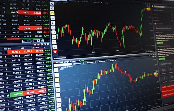
A pattern is a situation where elements of a chart are stacked in a specific, repeating order. A pattern looks like several points or candlesticks on a chart, placed in such a way that when the points are connected, a geometric figure is formed. Depending on the type and direction of the pattern, the trader receives a signal about the next price movement.
The patterns are based on the observation of the chart. Traders have noticed that the charts in trading terminals and analytical platforms can “draw” figures – to form a visual “picture” from candlesticks and lines. Recall how the Big Dipper looks like in the night sky – seven bright stars are connected by lines, and a bucket is formed. Traders determine patterns in approximately the same way. Only instead of stars, they use candlesticks indicating maximum and minimum prices in the time interval.
Most patterns are determined visually. You can use the drawing tools and lines available in many terminals for convenience. Detection of a pattern can serve as a signal to open a position. Most of the patterns involve a trend reversal or signal the continuation of a trend. Other patterns are universal – the signal depends on the trend and the position of the pattern on the chart.
Chart patterns can be used by mid-term and intraday traders. It depends on the trader’s strategy and on the particular pattern. Some patterns show better results on small timeframes (1m to 1h), but most are confined to medium timeframes (1h to 1d).
Of course, shapes are no guarantee that the market will go exactly as predicted. But searching for and correctly reading the patterns will help a trader to determine the trend, market dynamics, possible entry and exit points. Let’s consider existing patterns and situations when they occur.
Trend reversal patterns
When head and shoulders, double/triple top/bottom patterns appear, a change in the current trend or a serious price correction is likely. Often such patterns are formed at the historical maximums or at the strong support/resistance levels.
Head and shoulders
Head and shoulders pattern represents three tops. The middle one (head) is the highest, the tops on the edges (shoulders) are approximately at the same level. Entry into the position is possible at the breakdown of the neck line or at the price testing after the breakdown. In a downtrend, the pattern is formed mirrored.
triangle, ascending triangle, descending triangle, symmetrical triangle, bullish wedge, bearish wedge, wedge
Double top and double bottom
This pattern represents two/three tops or bottoms stopping at the same level. The price returns to the last low or high and then breaks the low/maximum, reversing in the other direction.
A double top is formed in the same way as a triple top. The key difference is that the support line is broken after the second peak. Traders look for entry points after the level breakdown or its subsequent testing.
Diamond
The “Diamond” pattern is a signal of a possible trend change. Sometimes this pattern is called “Diamond”, “Rhombus” or “Crystal”. A diamond looks like a quadrangle with the corners facing upwards, downwards and sideways. The upper and lower corners are approximately on the same axis, a slight shift is allowed.
When forming a diamond, extrema first move away from each other, then get closer. For example, if the figure appears on a falling trend, the lows will be renewed, each peak will be further from the previous one. After the peak divergence (central axis), the lows will rise and the highs will fall, narrowing the right corner of the diamond.
If the diamond is formed on a rising trend, a fall in price is possible after it. Such a figure appears mirror-like – on a rising trend, first the timeframe maximums are updated, then the corridor between the extremums widens.
Pipe bottoms (Bull and bearish takeover)
The Pipe Bottom is a simple candlestick pattern found on large timeframes. It consists of two candles, so it doesn’t quite fit into the pattern concept. Nevertheless, a pipe bottom can be represented as a geometric figure – a rectangle stretched downwards. A pipe bottom is two strong, long candlesticks, formed at the minimum price on the segment. The first candle is red, the second is green. Indicates a prolonged series of sales followed by a long bounce. They appear before a trend reversal, sometimes short-term, sometimes stable.
The inverse pattern is a pipe top. It is formed in a mirror manner, i.e. at maximum prices. The first candle is long and green, indicating a series of purchases. The second candle is red, indicating a series of sales. Whereas the bottom indicates a reversal to growth, the top indicates a reversal to a downtrend.
A similar pattern is the “Spike”. The difference of this pattern is that the Pipe bottom/top always consists of two long candlesticks of different directions. The spike may have additional short candlesticks. That is, the pipe is formed by one strong price impulse up/down and moves back, while the spike may “break up” into two or three candles, but with the same effect.
Three Crows
The Three Crows pattern is sometimes called the Three Black Crows pattern, where black means the market is over and the time for the “bears” is coming soon. This is not really a chart pattern, but rather a light candlestick pattern. But it’s very useful and easy to observe. It’s formed by red candlesticks and indicates a switch from a growth phase to a decline in price.
To “read” this model correctly, you need to consider the length of the previous green candlesticks. Three red candles are considered “black crows” when their combined length exceeds the combined length of the previous three green candles. Sometimes the appearance of crows is preceded by a small correction. For example, several short “sell” candlesticks. In this case, the “three crows” signal the confirmation of the selling trend.
Dragon
The Dragon is a rare pattern that portends a trend reversal. At least it consists of four points – “head”, “front paw”, “hump” and “back paw”. “Head” is the starting, upper point of the figure. It is a candle, completing a sideways movement/phase of small growth. After it a series of sales starts.
The second point is formed when the sales finish, the correction “upwards” and a series of green candles appears. The second point is the “forelegs”. The candle where growth is interrupted and the decline begins is the “hump of the dragon”. After the “hump”, sales continue until the price reverses on the “hind legs”. After the hind legs a large trend reversal begins (visual “dragon’s tail”). It is in the “tail” that traders open a buy position.
The “front paws” of the classic “correct” dragon are slightly lower than the “back paws” (about 10-15%). That is, the first candle is “cheaper” than the second, which forms the back legs.
The line drawn from the “head” to the “hump” should be descending. At the same time, both paw candles are placed below this line. The “hump” is placed at 30-50%, not lower. The fifth point is conditional – this is the place where the “head-hump” line crosses the chart after the price rebounds from the back legs. If you connect all the points with lines, you will get a zigzag tapered towards the end. The Fibonacci levels indicator can be used to calculate the distances between the points more precisely.
The Dragon can be bearish – it can appear after a series of purchases. Then the “head” is the point of sideways/sales exit before the growth phase. Otherwise it is strictly symmetrical: the first “paw” is the end of the long series of buys and a slight correction, with a short-term drop of the price, and the “tail” is the reversal of the big trend, coming from the “head” of the dragon.
Trend continuation patterns
After the end of the trend continuation pattern, the price movement in the previous direction is most likely. The main trend continuation patterns are the pennant, flag and rectangle.
Rectangle
Rectangle pattern (range, corridor, consolidation) is formed by horizontal support and resistance lines on the chart. The price gets into the range after the strong price impulses. The longer the price is in the range, the higher the probability of breaking through the boundary.
Rectangle pattern, patterns for analysis
Flag
The boundaries of the flag pattern are directed against the main trend. This pattern usually appears after strong price movements. The flag pattern may indicate that the bears took the correction as a reversal. It is possible to break through the boundaries of the channel and continue the trend in the same direction. Traders open a position after a breakdown of the boundaries of the flag in the direction of the main trend.
A bullish flag
When a bullish flag occurs, the price rises and then consolidates in a narrow range. The highs and lows of the correction are between the pattern boundaries. When the upper boundary of a bull flag is broken, the continuation of the main trend is most likely.
A bullish flag pattern for technical analysis, technical analysis in trading
Bear Flag
The bear flag pattern is characterized by a fall in price. After that the price consolidates and continues to move in a narrow range. If the bottom boundary of the bearish flag is broken, the downtrend is most likely to continue.
Pennant
A pennant is formed in a similar way to a triangle. The key difference is that the upper boundary of the pennant is downward while the lower boundary is upward. The pattern usually appears after strong impulse movements in the direction of the main trend.
A bullish pennant
A bullish pennant resembles a symmetrical triangle. As a rule, a bullish pennant pattern continues the current bullish trend. After the upper boundary of the pennant is broken, a price movement equal to the size of the pennant is possible.
bullish pennant pattern, bull pennant analysis
Bearish pennant
A bearish pennant is a mirror image of a bullish pennant. The pattern appears after a strong decline in price and ends with the appearance of a triangle in the form of a pennant. Usually a bearish pennant continues a bearish trend.
bearish pennant pattern, tehanalysis bearish pennant
A cup with a handle
“Cup and Handle” is a compound pattern that symbolizes the continuation of a trend. It is formed in the bull market and may serve as a signal to open buy positions. Conditions for the appearance of the “cup” may be described as several attempts of the “bears” to break the “bullish” trend. It usually appears after an upward price spurt and several high green candles.
After a bullish pullback, there is a struggle phase. It looks like a renewal of the lows and then the growth of the minimum extremums. At the same time, the highs are not updated – all the volatility is lower than the horizontal line drawn from the last candle of the “tug”. As a result, the lows describe a semicircle. The “cup” phase continues until the lows align with the original position.
When the “cup” is formed, the “bears” attempt to push the price down – this fighting phase forms the “handle”. If the buyers are stronger, the price trend continues to rise.
A mirror pattern – an inverted cup with a handle – is less common. Such pattern, respectively, occurs during a “bearish” trend and signals about its continuation. The “cup” phase is formed not by the lows but by the highs and also looks like an arc.
Golden cube
It is a quite rare pattern that occurs at the “sideways”. It signals the continuation of a flat, if it appears within a stable trend – the continuation of the trend. It looks like four candles, almost equal in size. These candles should be placed in a square. The height of each candle should be approximately equal to the width of the whole “bunch” of four candles.
It is permissible for the candles to differ slightly in body length. The length of the wicks makes no difference. It’s important that the candles were not too long, relative to the neighboring “neutral” candles. Otherwise, the figure can be interpreted as a spike and a signal of a trend reversal.
Undefined patterns. Double-sided patterns
Undefined patterns can inform the trader about both trend continuation and reversal. The price direction depends on the slope of the pattern lines in relation to the current trend.
Triangle
A triangle is usually formed when the top and base of price move toward each other (like the sides of a triangle). Often this pattern is referred to as a trend continuation pattern. In practice, a trend reversal is possible with a triangle.
Rising Triangle
An ascending triangle has a horizontal resistance line. With each wave, the lows are anchored higher and the price range becomes narrower. Usually, traders consider breaking the resistance line or rolling back to it to enter long positions.
Downward Triangle
In a descending triangle, one side of the pattern is formed by horizontal support and the other by declining highs. A descending triangle is the opposite of an ascending triangle. With this pattern, traders look for entry points after a breakdown of support or a pullback to it.
Symmetric Triangle
A symmetrical triangle reflects a situation in which the tops of prices are lower and the bottoms of prices are higher. Both sides of the triangle have the same angle of inclination. With this pattern, it is extremely difficult to determine the price movement. A breakout can provoke a price movement equal to the size of the pattern.
Wedge
In a rising trend, a trader can observe a bearish or bullish wedge. Unlike triangles, wedges do not have a flat side. Both sides slope in the same direction.
A bullish wedge
In a bullish (downward) wedge, local lows are updated. At the same time, the price in the range slows down. Therefore, on a rising chart, a bullish wedge looks like a small correction. The highs and lows of the wedge converge. Traders usually open short positions after breaking the upper boundary of the bullish wedge.
Bearish wedge
A bearish (rising) wedge is formed similarly to a bullish one. The difference is that the local maximums are being updated. The price slows down in a decreasing range. In a bearish wedge, a trend reversal or subsequent correction is possible.
Three Indians
Three Indians is a pattern formed from a trendline. It is sometimes called the Three of Touches. The second name accurately reflects the meaning of the pattern – the price must touch the drawn line three times for the trader to perceive the figure as a signal to trade.
The Three Touches can be used as a trend reversal indicator or as a confirmation indicator – depending on the type of pattern formed. For example, if three minimum touches are found (the line is plotted below the candlesticks), with each minimum higher than the previous one, this is a signal for the continuation of a bullish trend. If the line is above the candlesticks, touches three highs, and each high is higher than the previous one, it can be expected that the trend will reverse and the price will fall.
On a downtrend, the pattern reads in a mirror manner. Three lows, each lower than the previous one – continuation of the bear market. Three highs, each lower than the previous one – trend reversal to growth.
Harmonic Patterns
Harmonic patterns are complex patterns consisting of at least five points. The correct interpretation of harmonic patterns depends on the figure and its proportions. That is, the pattern signal should be considered only if the figure corresponds to the necessary parameters.
The proportions in GP are defined as the level of correction (in some sources – correlation). Simply speaking, one point of the pattern must “rollback” from the previous price by n-level. Or vice versa – to rise in the price to the necessary level, so the point can be considered an element of a pattern. You can use the tool “Fibonacci Correction” for calculations. Modern analytical platforms and terminals have auxiliary tools – templates.
For example, in TradingView there is “Template XABCD”. The trader just needs to put five points on the chart, and the indicator will automatically calculate the proportions between X, A, B, C and D. If the obtained proportions correspond to the pattern rules (see below for the rules), the pattern can be perceived as a signal.
Gartley’s butterfly
The Gartley’s butterfly is a harmonic pattern, consisting of five points. It looks like two triangles connected in one place. The first point of the butterfly is placed on the candle, at the beginning of a sharp price decline. The candle completing the series of sales before the reversal is the second point. It can be called the lower part of the left “wing” of the butterfly. After that the price rises again to a relatively high level. But not higher than the starting point. Thus, the first “wing” is formed – a triangular pattern.
After the end of the first wing the price goes down again – to the level close to the lower corner of the first “wing”. The price does not necessarily have to reach the same level as in the first wing. The angle of the second wing may be slightly higher or lower. But visually it forms the second triangle. The subsequent bounce continues until the price rises higher than the point of convergence of the two “wings”. After that, the pattern is formed.
The standard “Gartley’s butterfly” implies that the distance from the second point to the third is approximately equal to the distance from the fourth point to the fifth. In harmonic patterns, this principle is known as “AB=CD”. In this case, if you draw segments between AB and CD, they will be placed almost parallel (perhaps not perfectly, but approximately).
The first point is denoted as “X”. If the segment from X to A goes from the bottom to the top and from C to D goes from the top to the bottom, such a butterfly is considered “bull”. After it is formed the growth of the instrument price is expected. If the ray from X to A goes downward, and from C to D goes upward, the butterfly is bearish and causes the price to fall.
An important point is the proportions of the butterfly. They depend on the ratio of corrections. The ideal pattern has an XB of 0.61, AC of 0.78, BD of 1.27 and XD of 0.78. Many trading/analytical platforms (for example, TradingView) have special tools that allow building “XABCD” patterns and automatically calculate the correction parameters.
Bat
The “Bat” figure also belongs to the harmonic patterns. Visually, the bat resembles the “Gartley’s Butterfly”, but with different construction parameters.
“Bull” bat consists of two triangles, whose sharp corners face upwards (points A and C). The line from X to A goes from bottom to top, and from C to D – from top to bottom. The “bear” bat has its angles facing downward, the line XA goes downward from the top, and the line CD goes upward from the bottom.
Visually, the bat differs from the Gartley’s Butterfly by its narrower “wings”, especially at points A and C. The ideal proportions of this pattern by correlation: XB – from 0.32 to 0.50, BD – from 1.61 to 2.61, AC – from 0.38 to 0.88. The most important segment is XD. Here the ideal correlation parameter is 0.886. That is, the price of point D correlates with the price of point X by 0.886%. In other words – the candlestick, forming the point X, is a little higher than the candlestick of the point D in a “bearish” pattern. And a bit lower if the pattern is bullish.
The Crab
The harmonic pattern “Crab” can herald the appearance of a downward or upward trend in prices, depending on the position of the pattern. A “Bullish” crab is a pattern of five points where the first point is higher than the fifth point. The other three points are higher than the line drawn between the first and fifth. The segment drawn from the first to the second point goes upward. From the fourth to the fifth point it goes down. The “bear” crab has the first and fifth points higher than the others. The line from the first to the second point goes downward, from the fourth to the fifth point goes upward.
The “crab” can be distinguished from the “bat” by paying attention to the central point (the third, B). If you draw a conventional line X-D, the point B in the “crab” will be noticeably lower than this line and closer to the “floor” of the figure in the “bearish” variant and to the “ceiling” in the “bull” one. In the “bat” the point B is much closer to the center of the figure.
The ideal proportions of the correlation levels: XB – 0.38 to 0.61, BD – 2.24 to 4.23, AC – 0.38 to 0.88. The ideal XD correlation ratio is 1.618.
Shark
Shark is a pattern close to the “Butterfly” and “Bat” patterns. The key difference of the “Shark” is that the last point is much higher than the starting point. The figure is slightly shifted visually.
If you draw conditional lines from the first point to the second, from the second to the fifth and from the fifth to the first, you get a narrow triangle with an acute angle at the last point of the figure. The “Shark” points are usually designated as 0XABC (in other harmonic patterns – XABCD). This is due to the fact that “Shark” can go into a 5-0 pattern. Accordingly, the 5-0 pattern will start from point X, the second point of the “Shark”.
The ideal Shark has the following proportions of correlation: XB – 1.13 to 1.61, AC – 1.61 to 2.24, 0C – 1.13. For a “bull” Shark the segment 0C is at the bottom of the figure. The line 0X goes from the bottom to the top, the line BC goes from the top to the bottom. Point B is above point X, point A is below points X and B. The “bearish” Shark has the 0X line going down from above, the BC line going up from below. Point B is below point X, point A is above points X and B. The segment 0C is placed in the upper part of the figure.
5-0
The “5-0” pattern is five points spaced on the chart extrema, taking into account the correlation, between individual points. It is marked by XABCD points.
Pattern “5-0”, patterns of technical analysis
The pattern “5-0”, shown in purple
In a bearish pattern, the starting point (X) is placed higher than the second point (A) and forms the first triangle together with the third point (B). B is placed well above A, at the price high. The next points C and D are placed at the next minimum and maximum. Two triangles are formed, XAB and BCD.
Patterns 5-0 and Shark in technical analysis
The “5-0” pattern, combined with the “Shark” pattern. 0 – the first “Shark” point, X – the first “5-0” point. C – last “Shark” point, D – last “5-0” point. Shown on the left is a “bullish” version of 5-0, on the right – a “bearish” version.
Unlike other harmonic patterns, triangles can be visually very different, both in the direction of acute angles and in “area”. “Bullish” variant is formed mirror-like: X is below A, A is above B. The segment AC is in the upper part of the figure, BD is in the lower part.
The following correction parameters are necessary for the correct formation of the figure: the segment XB – from 1.13 to 1.61, AC – from 1.61 to 2.24. The BD segment should be close to a value of 0.50.
Conclusion
Patterns help a trader to predict the market development and price changes for an instrument. Technical analysis patterns do not guarantee the market development in the n-direction. Nevertheless, technical analysis is used in trading along with fundamental analysis, as it gives traders a deeper understanding of the market.